

Quadruple Impact is a task management tool, designed to help teams organize and track their work collaboratively.
Team
Product Manager
Product Designer (myself)
4 Developers
Duration
3 months
As being the solo designer on the OKR integration at Quadruple Impact, i was responisble for the end to end design process, I researched the histroy of the OKR system and the way it works and integrated in companies, conducted competitive analysis, defined information architecture, user flows and wireframes and built core components related to the feature on top of QI design system
The main issue at QI, was that teams and individuals had no idea how their work contributed to the companie's strategic objectives, teams mostly relied on meetings to stay alligned, on the other hand managers and stakeholders couldnt track goals progress properly.
We introduced an integrated OKR system that allowed users to connect tasks directly to objectives and key results. This made it easier to track progress toward strategic goals and helped users see the bigger picture behind their work.

I worked closely with the product manager to understand the core problem and explore how an OKR system could address it. Through my research and analysis, I identified several key pain points:
Competitors Analysis
I found the main competitors ( Viva Goals, Weekdone, Asana and Quantive) and carefully examined their features. I gathered insides for the industry. I saw what works and what doesn’t.
Informatoin Architecture
I structured the OKR creation from a few different places in the application, the Main creation from the chat as it is built for the othre actions (task and meeting creation) from the okr tab

User Flow
I mapaped out three primary user flows: one for OKR creation that i manily coming fom the chat for each worqroom in QI, one for okr and key results checkins and user flow from the main OKR tab

Wireframes
I started by sketching wireframes to establish a solid foundation for implementing the feature. This approach helped me align the design with the app’s architecture while ensuring a clear and easy experience. By focusing on structure and functionality early on, I was able to refine the user flow and make informed design decisions that enhance usability.

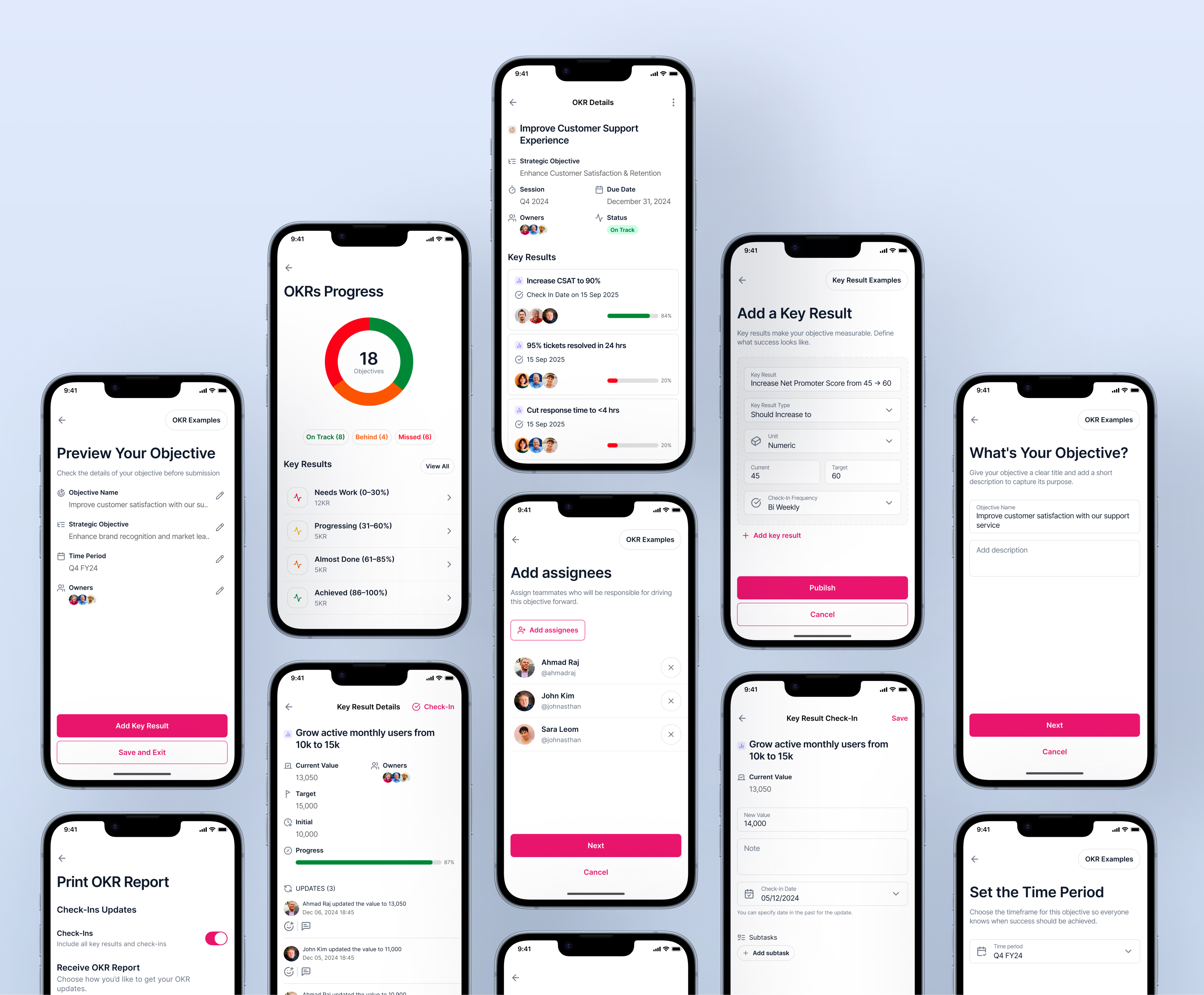
After validating the initial wireframes, I moved into high-fidelity designs. My focus was on making the OKR system simple, visual, and intuitive, while maintaining consistency with the existing design system.
Creation Flow
The creation flow was the most important part of this project. My early iterations placed all the required fields on a single screen, which felt overwhelming and cluttered. Through testing and feedback, I realized that users needed a more guided experience.
In the final design, I simplified the process into a step by step flow, allowing users to add one piece of information at a time (Objective → Key Results → Tasks). This reduced cognitive load and made the process feel approachable, even for first-time users.

Objective & Key Result Cards
Another major design focus was the card system. I needed to create components that were both informative and adaptable across different contexts.
I designed two types of cards:
Each of these had two variations:

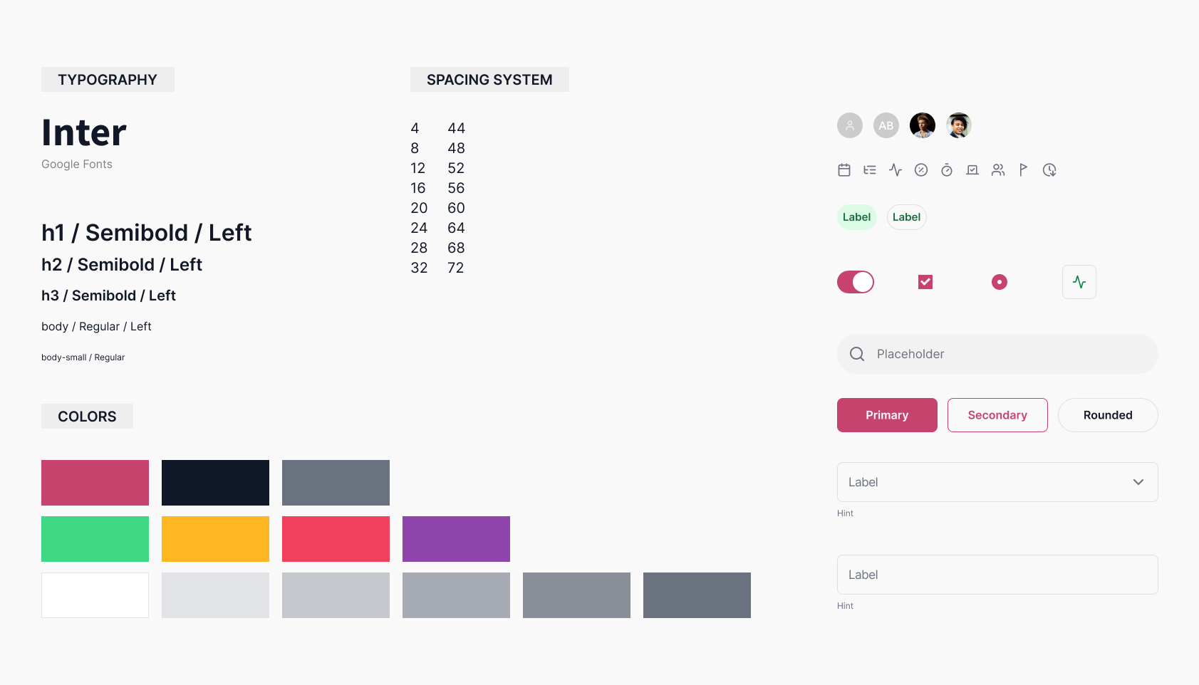
Components & Design System
To ensure scalability and consistency, I built the OKR feature using modular components from the design system I created for QI. These included:
After more than 4 months of hard work, we launched the OKR feature.
